Terminology
📘 Understanding Key Terminology in Acquaint Web
The Acquaint Web App uses a variety of terms that are helpful to understand as you navigate its features. Below, we’ll explain some of the most commonly used terms to help you get up to speed and make the most of the app.
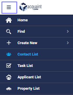
📂 Side Navigation Bar
The Side Navigation Bar provides quick access to key features within Acquaint Web.
On desktop, you'll find it on the left-hand side of the screen.
On mobile or tablet, tap the hamburger icon next to the Acquaint logo to reveal the menu.
This adaptive layout ensures seamless navigation across all devices.
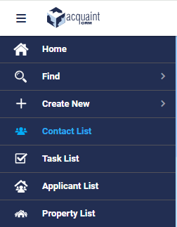
🧭 Hamburger Icon
A three-line icon typically used to toggle navigation menus. When clicked or tapped, it reveals or hides the side menu—most commonly found on mobile and tablet devices.
⚡ Action Menu
Represented by a lightning bolt icon, usually located next to the Edit button. It provides quick access to additional functions and shortcuts across various parts of the app.
🧪 Filter Menu
Visually resembles a small cooking filter or funnel. Found mostly on heading bars, it allows you to refine data views by specific criteria such as status, type, or branch.

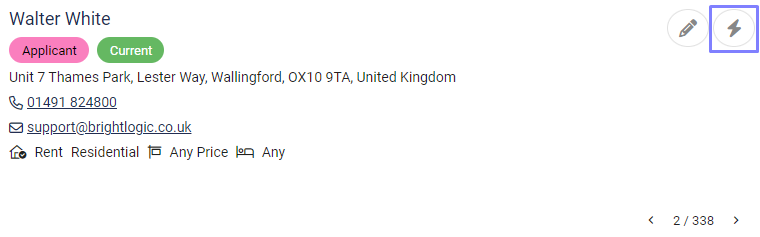
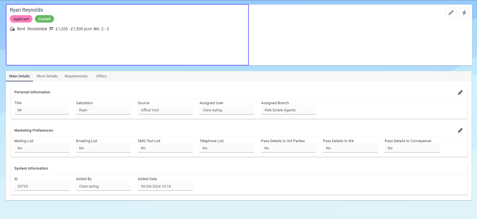
👤 Contact Summary Card
Displays key details about a Contact at a glance—ideal for quick reference or sharing essential information efficiently.
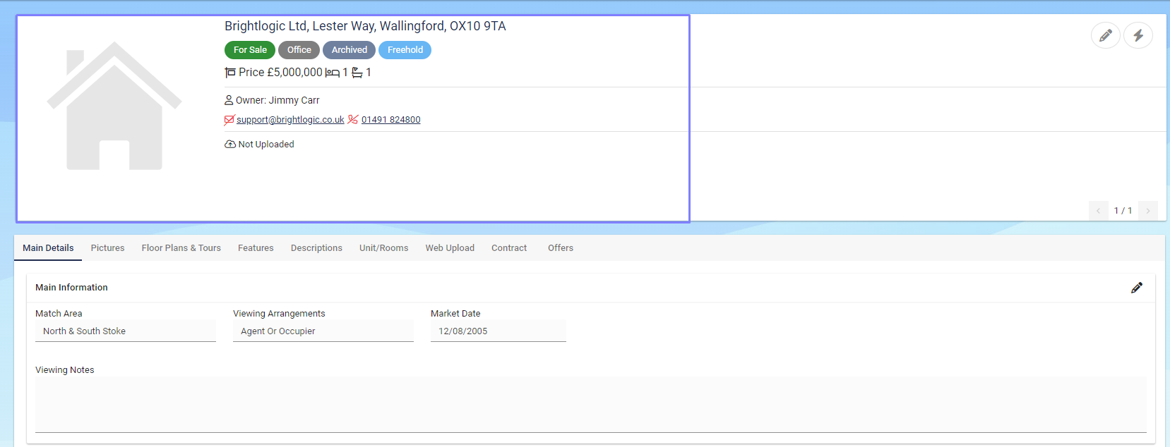
🏠 Property Summary Card
Offers a concise overview of the most important information about a Property, making it easy to scan and share essential details.